Color Field
Table of Contents
This is an advanced-use feature, and likely not something you'll need to configure. What you probably want is the content types reference!
The color field is a visual color picker. This field is used for content values that handle the rendering of color. Can be saved as RGB or hex value.
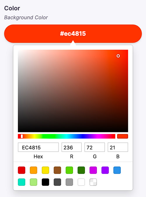
There are two types of color widgets, "sketch" or "block". The "sketch" widget allows the editor to pick a color from the familiar picker seen below.

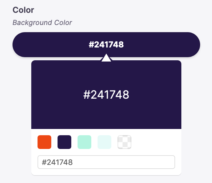
The "block" widget allows the editor to choose from a set of predefined color swatches.

Options
interface ColorConfig {component: 'color'name: stringlabel?: stringdescription?: stringcolorFormat?: 'hex' | 'rgb' // Defaults to "hex"colors?: string[]widget?: 'sketch' | 'block' // Defaults to "sketch"}
This interfaces only shows the keys unique to the color field. Visit the Field Config docs for a complete list of options.
Definition
const BlogPostForm = {fields: [{type: 'string',name: 'rawFrontmatter.background_color',label: 'Background Color',description: 'Edit the page background color here',ui: {component: 'color',colorFormat: 'hex',colors: ['#EC4815', '#241748', '#B4F4E0', '#E6FAF8'],widget: 'sketch',},},// ...],}
Comparisons
© TinaCMS 2019–2024